First off, what is a website ‘bounce’?
It’s when someone visits just one page of your website and leaves without going any further on your site.
A high bounce rate can kill your conversion rate AKA the amount of people that call you, fill a form to speak to sales or make a purchase.
What’s a good bounce rate?
According to SEMrush, the 26% – 40% range is optimal.
How can you check your website bounce rate?
Install an analytics tool like Google Analytics. Then you can check the bounce rate for your site in full over a specific number of days as well as the bounce rate of certain pages.
Here are a few ideas that might help lower your website bounce rate and up your conversions.
1. Page speed
This can be a silent killer of websites. Aim to get yours around 1 sec. Use a tool like Google PageSpeed Insights to test your site speed on mobile and desktop.
If your site loads slowly, visitors will get frustrated and head to a competitor that gives them a much faster and better experience. Plus, page speed is a Google ranking factor.
Common culprits that slow down websites:
- Too many embedded videos
- High-res images that aren’t optimized
- Too many plugins
- Not updating your web platform/CMS e.g. WordPress
- Basic/slow shared hosting
Speak with a Professional B2B SEO Agency or web agency to help here
2. Design for mobile and desktop
A ‘responsive’ design for your website that adapts to mobile/tablet/pc is no longer good enough. Visitors want a site that loads perfectly on their device without having to scroll, zoom, or mess around to enjoy the content.
Designing your site for both mobile and desktop experiences helps massively here – meaning no matter what people open your site on, they can easily access all aspects of the site.
Mobile-friendly design is also a factor that affects your SEO.
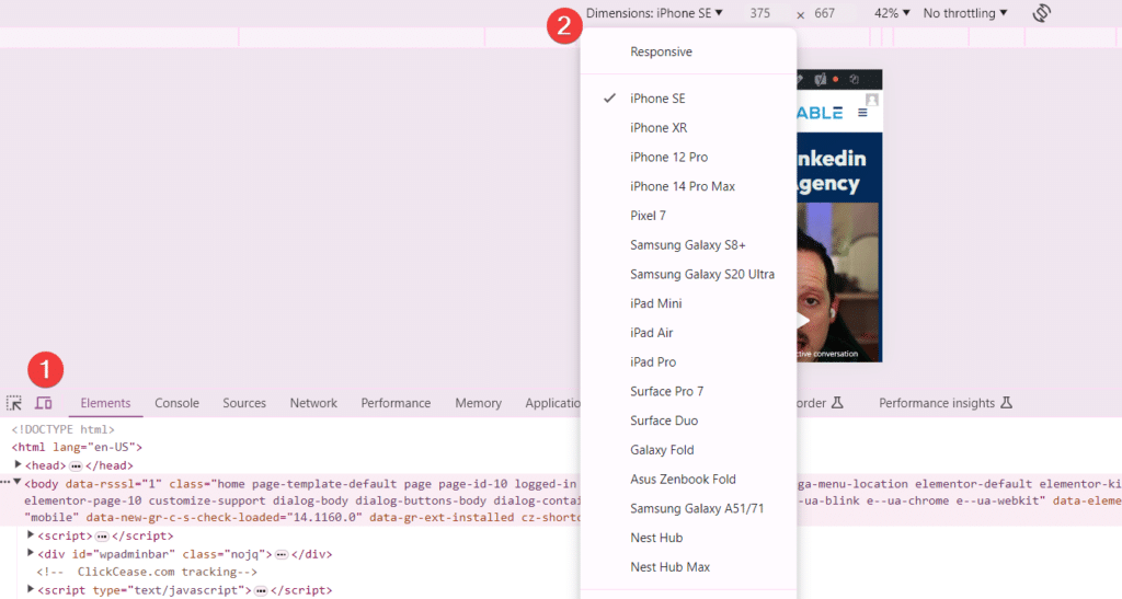
Tip: Pressing F12 on Google Chrome lets you toggle between mobile/tablet/desktop views.
3. Clear, relevant headlines
Make sure each page has a headline that is crystal clear. E.g., your homepage headline should clearly show how your offer helps, the problem you fix, or how you make people’s lives better.
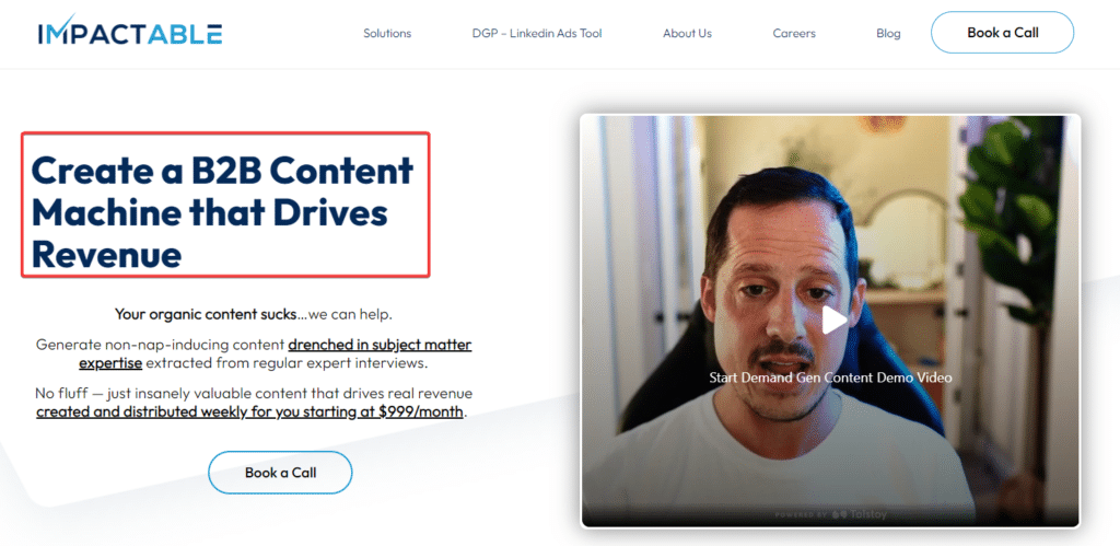
If it’s not clear, it won’t help your efforts to keep people on your site.
4. Simple navigation
This should go without saying but make your menu navigation for both desktop and mobile super easy to see.
So having a sticky menu that stays at the top of the page even when you scroll up or down. So no matter area of the site people are on, they can still navigate to other pages.
I also recommend having your main call to action in the menu, e.g., BOOK A CALL / CONTACT US, etc.
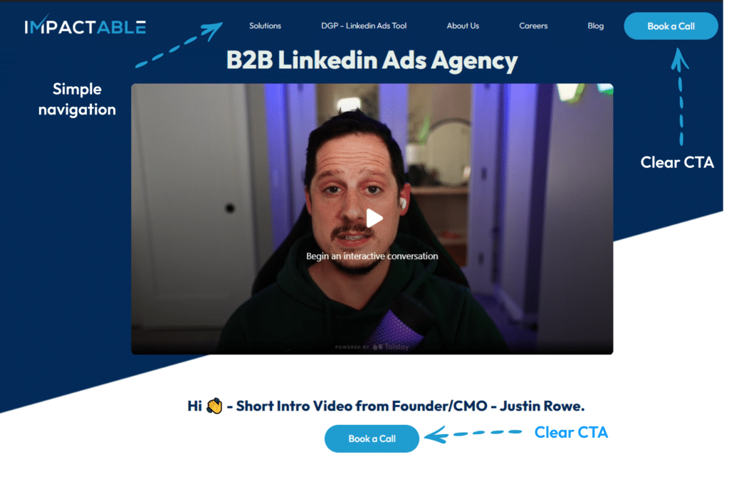
5. Main call to action (CTA) above the fold
People want information, fast. Have the main action you want visitors to take at the top of the page before they need to scroll down.
E.g. that could be VIEW OUR WORK / CONTACT US on the homepage under your headline.
Or on your results page it might be: VIEW CASE STUDIES / CONTACT US. Make the call to actions descriptive and clear.
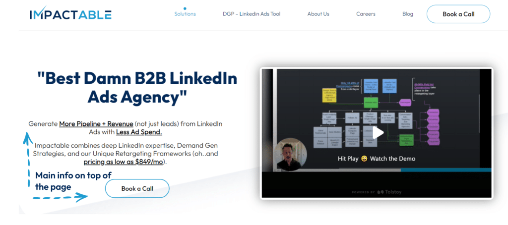
Don’t be afraid to use them as people scroll down through your content, too.
6. Handle FAQs and objections in your copy
Your web copy needs to work hard for your business.
If not, visitors exit, and you lose conversions.
Here are a few simple practices:
- Clearly show how your offer helps
- Shares the key problems it fixes
- Use tangible examples
- Avoid jargon (unless customers use it)
- Answers common questions
- Handle common sales objections
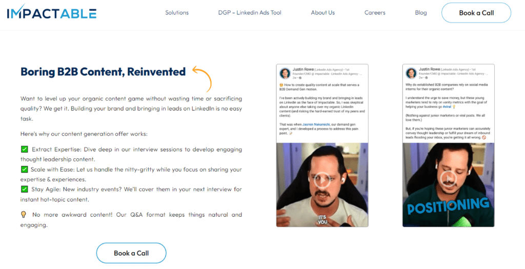
This will not only help your bounce rate and conversion rate but also give you super relevant copy that’ll rank on Google because you’re giving people what they actually want to know.
7. Social proof
Without proof, your content and claims are simply hot air.
Social proof can be things like:
- Customer testimonials
- Reviews
- Client success story videos
- Stats
- Examples
- Case studies
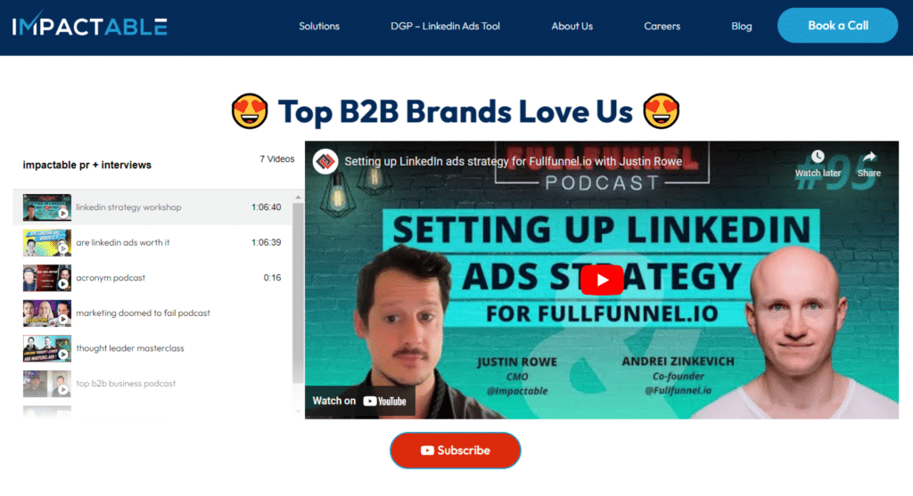
These reinforce your statements and claims and build trust and reputation with your website visitors.
I recommend using social proof on all key pages of your site.
8. Talk to customers
Ask your clients or, if you’re a new business, ask target prospects to give their feedback on what they feel could be improved in the design, copy, and layout of your key pages that have a high bounce rate.
Note patterns in the feedback and test the tweaks that are most requested in your design and copy.
9. A/B Test
This can work well if you’re running ads. You can test out different headlines, page copy, design style, layouts for landing pages by sending one ad set to one page and another ad to the 2nd page – and see which gives a lower bounce rate and conversion rate.
I’d recommend making small tweaks at a time to then review the analytics and date e.g. change the headline, then the copy, then social proof, then maybe CTA colours etc. This way you know exactly what impacts your results.
Cheers for reading
There you go, 9 ways to improve your website’s bounce rate.
Happy experimenting!

